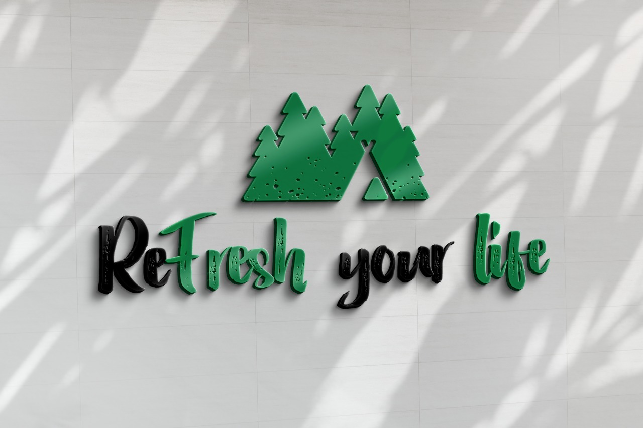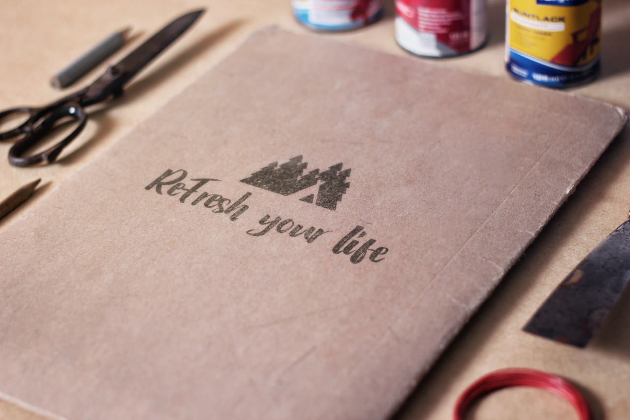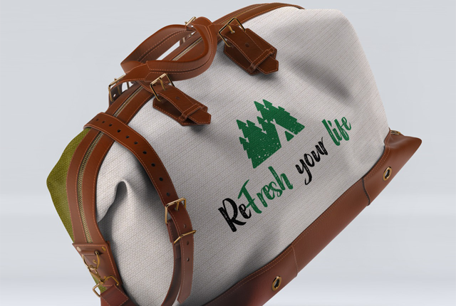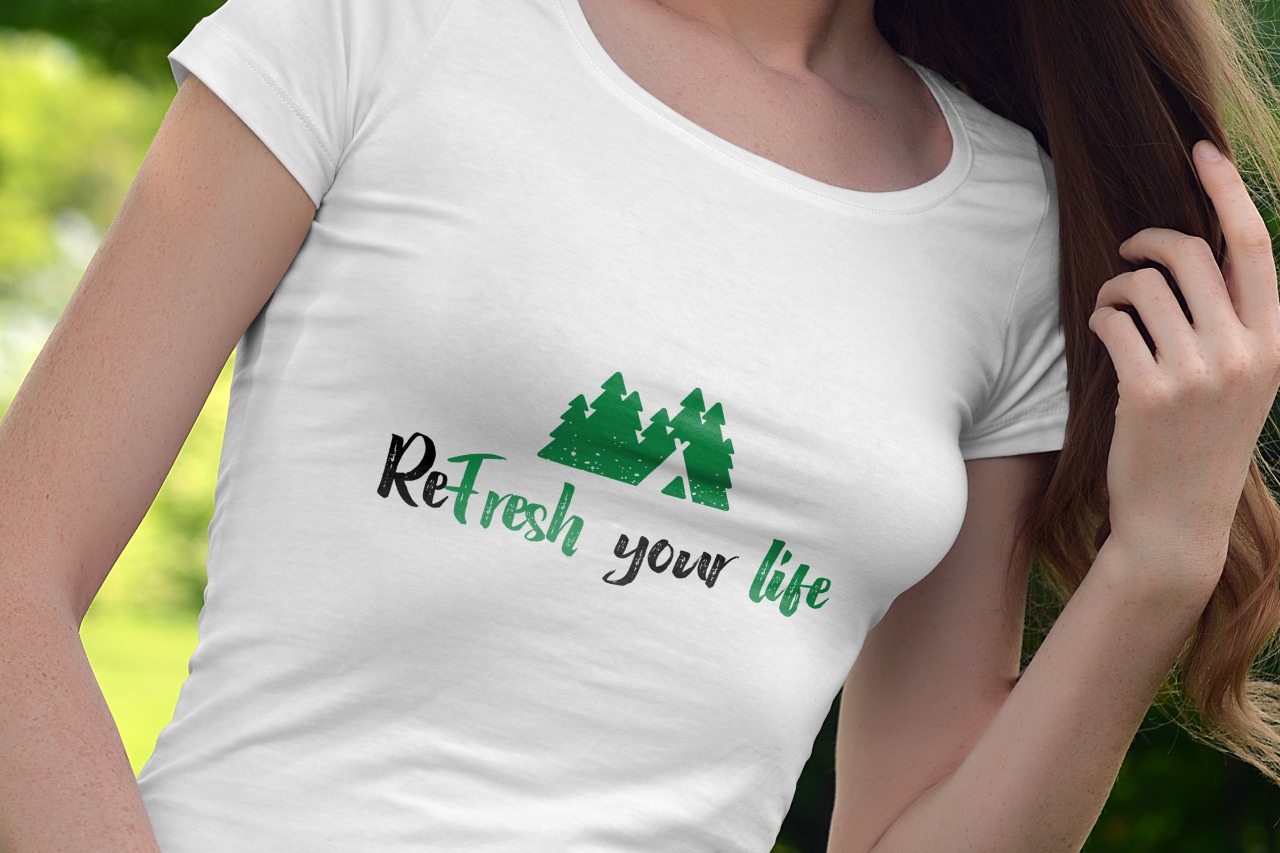
Re Fresh
This logo, in every aspect, is related to nature. Starting from the forms, elements, font, and colors, the vibe of nature is felt in every moment. The most interesting thing that this logo contains is the enumeration of elements. Starting with the shape of the mountain, the shape of the trees, and the camping tent. The intertwining with each other comes gradually making the logo even more interesting. The use of the mountain symbol is done to emphasize the power, confidence, and greatness that the mountain represents. Adventure and achieving goals is the secret message we want to convey through the figure of the mountain.
The symbol of trees represents longevity. The tree itself represents life. Through this, we specify the development and growth of the business. The camping tent represents life in nature and cooperation. In terms of colors, black and green are the most suitable to symbolize nature.