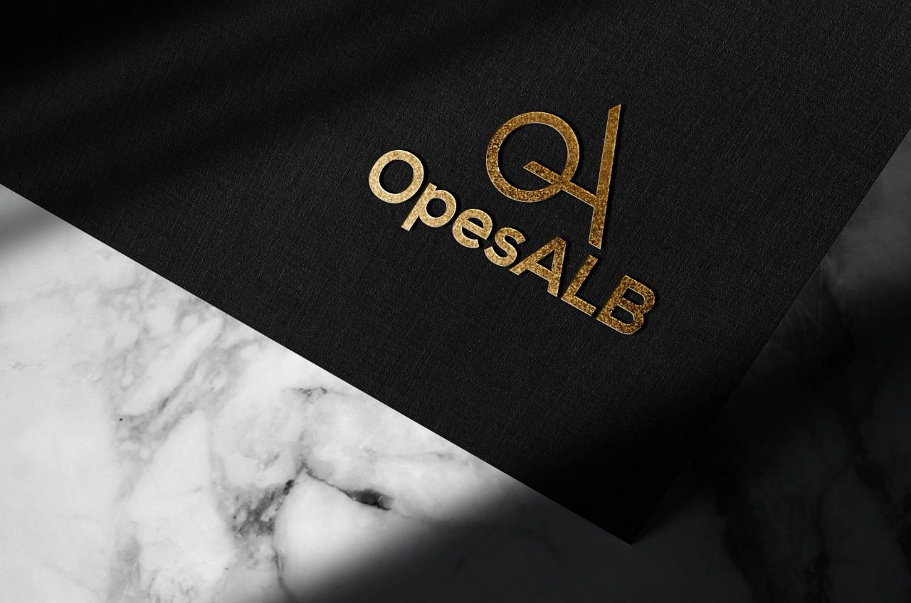
Opes Alb
The letter “A” symbolizes the shape of the triangle, creating the aforementioned trio: power, hierarchy, and improvement. The circle shape was used to represent the letter “O”. Using the circle in the logo creates a friendly and welcoming feeling. They are also a symbol of stability and cooperation.
Circles are an excellent way to attract attention, as they are not often encountered in everyday life. They symbolize the sun and convey positive energy at the first impact.
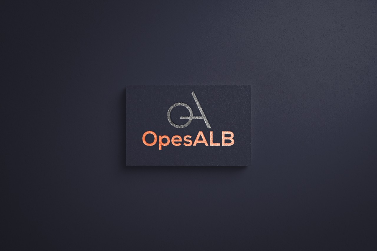
In terms of colors, the right combination of colors in a logo arouses certain emotions and consequently affects the decision-making of certain.
For Opes Alb, we use two completely different colors from each other. Black represents power and control on the one hand and professionalism and seriousness on the other. The color orange represents enthusiasm, a feeling of joy and warmth. The orange color is more noticeable to the eye and attracts attention. The combination of these two colors in the logo creates a balance that represents the brand: serious and professional but also hospitable and collaborative.